Analytics
-
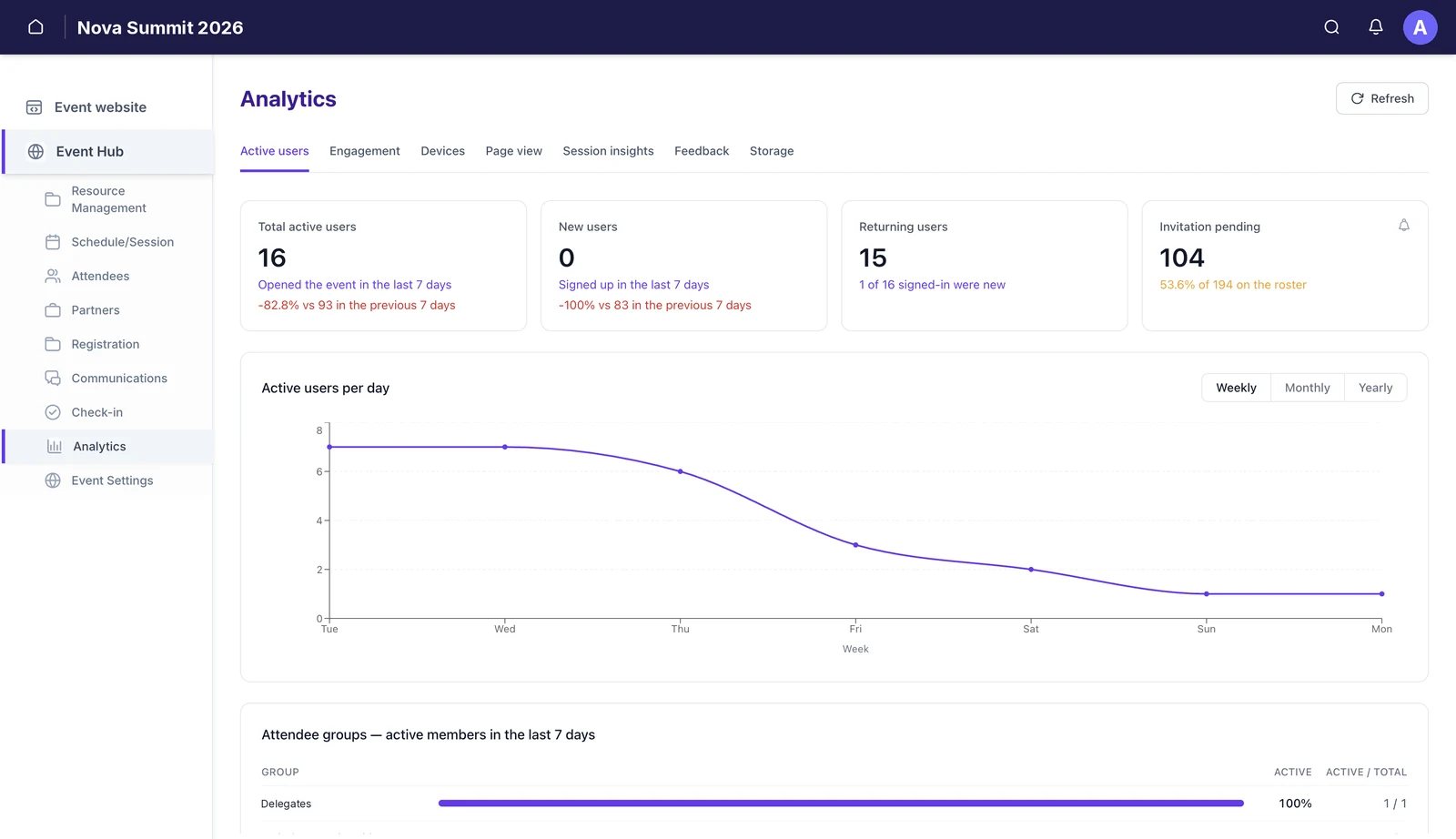 Who is turning upActive, new and returning users over a week, month or year, plus how many invitations are still unaccepted.
 -
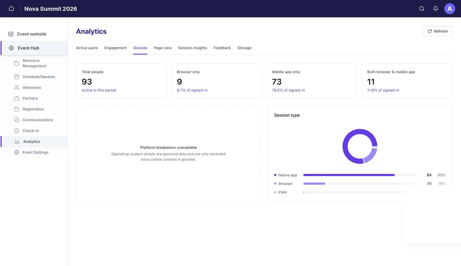 How they are getting inBrowser, mobile app, or both — which tells you where to put your effort.
 -
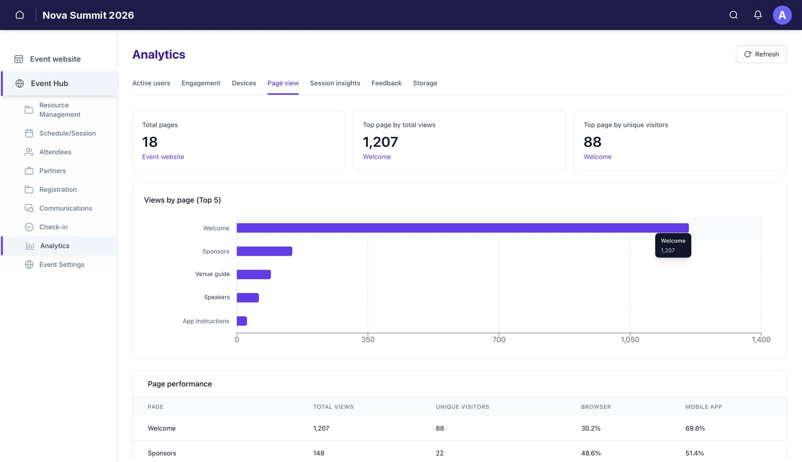 Which pages get readViews and unique visitors per page, split by browser and app.
 -
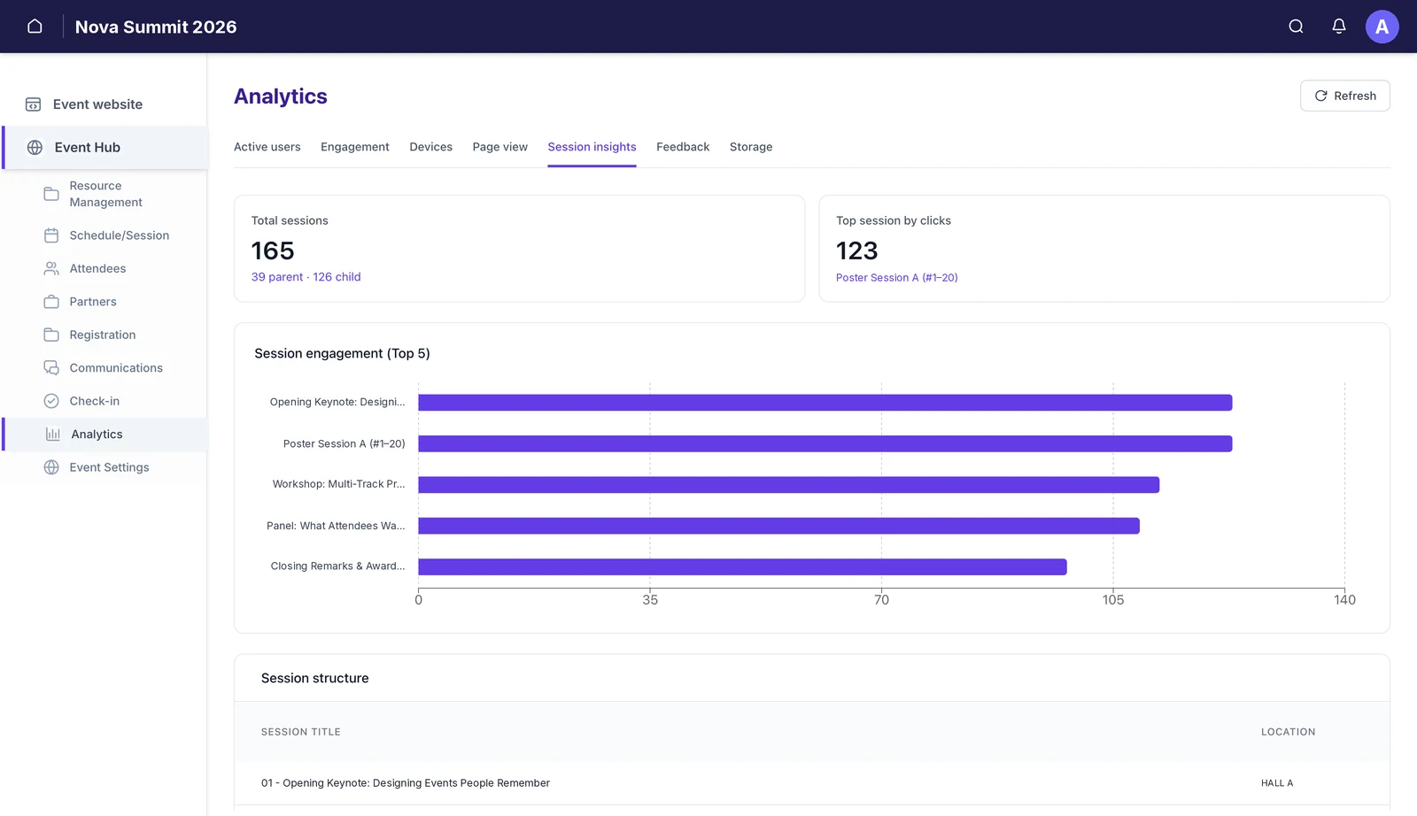 Which sessions pullClicks per session, and the parent/child structure of your programme.
 -
 What you are holdingFiles across the vault, media library and sessions, and how that has grown.
-
Active users — who is actually turning up
Four cards: Total active users (opened the event in the period), New users (signed up in the period), Returning users, and Invitation pending — people on the roster who have not accepted yet.
Switch the chart between Weekly, Monthly and Yearly; the cards follow the same period. Each card compares against the previous period, so a fall shows as a negative. Outside the run-up to your event that is normal and not a problem — an event app is meant to be quiet in March and busy the week of.
Invitation pending is the one to watch before the doors open. It is the gap between who you invited and who can actually use the app on the day.
Below the chart, Attendee groups breaks activity down group by group, with an active count and a percentage. Note the footnote: someone in several groups is counted in each, so the rows deliberately do not add up to your attendee total.
-
Engagement — conversations and comments
Three numbers: Unique conversations (direct message rooms opened), Profile views, and Total comments across all sessions. Below them sit comment feeds by group and by session.
Profile views are usually the liveliest of the three, and a good early signal that networking is happening at all. Comments tend to stay low unless you have actively asked people to use them.
-
Devices — browser, app, or both
Total people active in the period, then a split: browser only, mobile app only, and both. A Session type donut breaks sessions into native app, browser and PWA.
Operating-system detail is withheld unless cookie consent has been given. ⓘPlatform breakdown unavailable is not a fault. Operating-system details are personal data, so they are only recorded once an attendee grants cookie consent. If most of your audience declines, that panel stays empty — by design.This tab settles arguments. If four in five of your people are in the app, a change to the web experience will be seen by almost nobody.
-
Page view — which pages get read
Total pages on the event website, the top page by total views and the top page by unique visitors — which are often not the same page. A top-five chart sits above a full Page performance table: total views, unique visitors, and the browser/app split per page.
The gap between total views and unique visitors is the interesting part. A page with far more views than visitors is one people keep coming back to — the schedule, usually, or the venue map. That is a page worth putting in the menu, not burying.
⚠Unique visitors are counted per browser or device. The same person on a phone and a laptop counts twice, so treat unique visitors as an upper bound on headcount, not a headcount. -
Session insights — which sessions pull
Total sessions, split into parent and child so you can see how much of your programme is nested, and the top session by clicks. A top-five engagement chart ranks sessions, and Session structure lists every session with its location.
Clicks, not attendance — this measures interest, not who was in the room. Worth being precise about what this counts: clicks on the session in the app. It tells you what people were drawn to when planning their day. For who was actually present, use check-in; for what they thought of it, use feedback.
-
Feedback
Star ratings and comments per session, with an average, a rating distribution and a response-by-response table. This tab has its own article — see Collect session feedback.
-
Storage — what the event is holding
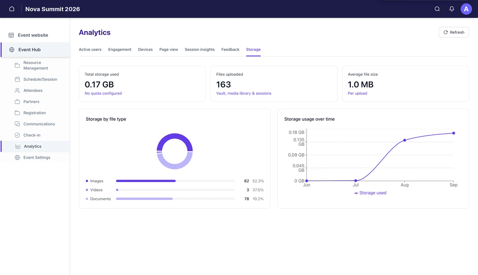
Total storage used, files uploaded across the vault, media library and sessions, and average file size. A donut splits usage by images, videos and documents, and a line chart shows growth over time.
The count beside each file type is the number of files; the percentage is its share of the space. Read those two numbers separately. A handful of videos will be a small count and a large share of the space, while hundreds of documents can be most of the files and very little of the storage.
What this isn’t
- It isn’t cross-event. Every figure is for the event you are in. Portfolio reporting is on the roadmap.
- It isn’t attendance. Session insights counts clicks. Check-in is what records who was in the room.
- It isn’t retrospective. Collection starts when attendees begin opening the event website. Anything before that has no history.
- It isn’t a substitute for consent. Operating-system detail is only recorded where cookie consent has been granted.
Still need help? Reach our team and we'll get you sorted.
Contact support →